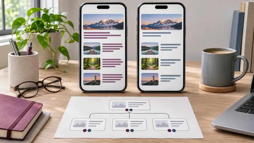

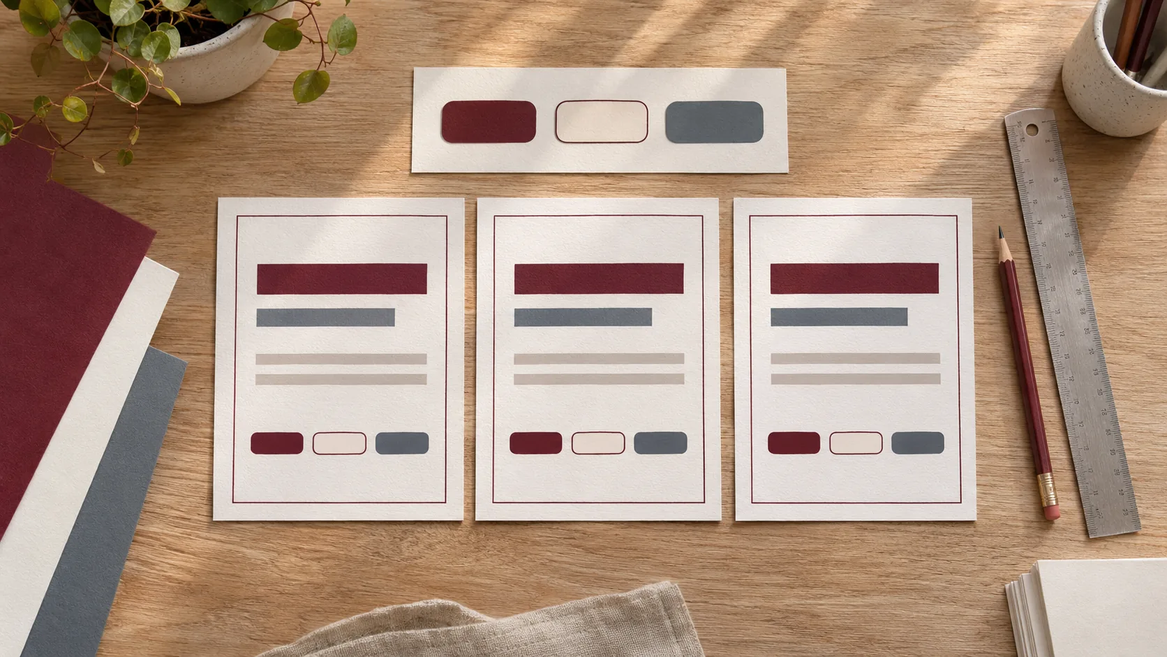
Illustrative design materials for reviewing common styles and their variants.
Changing one card’s spacing in Bricks is easy. Finding which of twenty similar cards should share that spacing is where maintenance gets expensive. A style cleanup starts with a small inventory and one representative section. That makes it possible to improve editing without accidentally changing a template your live site depends on.
Choose the edits that cause the most friction
Ask your editor to show two or three tasks that regularly cause rework. A button may look different on a product page and a blog template. A landing page may have its own headings because it was copied from an old campaign. The first phase should cover the sections people will edit again.
Find the level at which each important style is set. It may come from an element, a global class, theme defaults, a variable or custom CSS. Record template uses and conditions as well as page URLs. A reusable class can have an effect far beyond the page where you first see it. Bricks Style Manager and global classes reference.
Separate genuine variants from accidental drift
Look at a fictional services site with two card designs. The main service grid has white cards with thirty-two pixels of padding. The related-services template deliberately uses less padding because it sits in a narrower column. Both use the same heading colour and type. Keep the compact variation explicit while connecting the shared rules.
| Style | Where to define it | What to verify |
|---|---|---|
| Heading colour and type | Shared card style using the agreed variables if useful. | Both templates track the same approved design. |
| Compact spacing | Documented variant of the card style. | The narrow related-services column retains its intended spacing. |
| One-off illustrated campaign | Scoped exception on its own section. | The exception does not change the global service card. |
Adopt variables where repeated decisions should move together
Start with a few meaningful values such as text colour, action colour or a standard section gap. Give them names that tell editors and developers where they belong. Review what already exists before adding new variables that duplicate the same purpose.
Map classes and variables to the places you have inspected. Consider dynamic templates, responsive overrides and any conditional display. If a dependency is hard to verify, keep it in the inventory and test before removing it. Inspect approved exceptions alongside repeated defaults.
Check the pilot against real templates and content
Roll the pilot out on a staging copy across two different template contexts. Test a narrow viewport, a longer heading and an entry without an optional image. Check button focus and normal content editing. Compare the rendered public layout with the version the editor sees inside Bricks.
Have an editor add a card or change its heading with the usual permissions. If they still need to adjust spacing in several places, improve the shared style or provide a documented compact variant before extending the work.
Agree the rollout and what the editor can change
Record which templates are in scope, who reviews each layout and where shared styles should be edited. Depending on the site, the next phase might cover repeated sections first and leave a bespoke campaign untouched until it gets its own review.
If the pilot touches dynamic templates, carry through their field fallbacks and relationships. See the Bricks and ACF implementation guide and the Bricks project brief for the inputs that help estimate those templates.
Send two URLs and a recurring style problem
Send one page with the preferred layout, one that is hard to edit and the change the team wants to make regularly. Include your template or component names if you know them. I can review the dependencies and estimate a staging pilot covering the style rules and the editor handover.